Disclosure: Some of the links you’ll encounter are affiliate links. If you click and buy something, I’ll get a commission. If you’re reading a review of some precious metals company, please understand that some of the links are affiliate links that help me pay my bills and write about what I love with no extra cost to you. Thank you!
[stumble]
Buttons, huh?
I know you’ll agree with me when I say:
They’re small, but pack one heck of a punch.
Get them right and they’ll catapult your business, get them wrong and…
No!
There’s no need to continue this sentence because you won’t get them wrong, ever!
Thanks to this article you’re reading.
Think I’m tooting my horn a bit too much?
I tell you now:
By reading this post you will learn how to create and add buttons to WordPress posts and pages.
You’ll also learn “how” to create them, so you maximize the awesome benefits they can give you.
Sounds exciting?
Let’s go!
Table of Contents
How to Create a Button in WordPress with Shortcodes (Max Button)
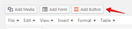
We’ll use a plugin called MaxButtons.
This plugin is:
- easy to use,
- free,
- regularly updated (outdated plugins are the worst)
- widely touted to be the best in the button making business.
And I believe it as I’ve used it before and it has never failed me.
See that button on the right, in my sidebar? Yes, it’s a Maxbutton.
Pay attention here:
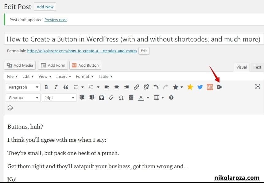
I don’t want to just tell you how to make and add buttons to a WordPress Site (that’s plain boring).
Instead- I’ll show you.
I’ll make my own button right here, right now; and later you can just copy what I do.
And since it’s hard to explain with words alone, I’ll be using lots and lots of images. Just follow the steps and if you don’t understand something, turn to the imagery.
#1- Basic settings
- Button name– Give your button a name. This is just to help you remember. Your readers will never see this.
- url– The destination where the button will take you when you click.
- Open in new window– I leave it unchecked because I want people to click the button and go read my review. The choice is yours.
- rel= “nofollow”- No if you target a page on your site, YES if it’s an affiliate link, or a site you don’t trust.
- Text– This is my button copy
- Font– Tahoma and italicised it- It doesn’t matter what font you use as long as it’s easy to read.
- Padding– I might move my text a bit lower or higher, but the default setting already has a nice feel to it.
- Text color– White because it contrasts nicely with the planned button color (spoiler: a shade of orange)
- Text color on hover– I use the color of the border.
- Button width and length. It’s fine the way it is. Extend/shrink the box depending on the number of words you have.
- Description– A blurb for you to instantly know what the button’s purpose is.
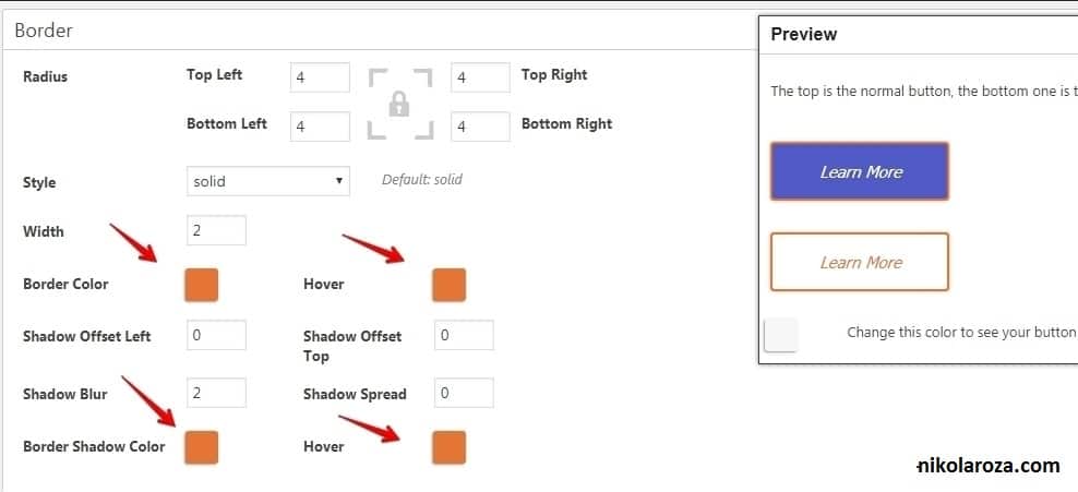
#2 Border
I don’t spend too much time with this as I think the borders are already the way they should be. Not too thick- not too thin.
But you’re free to play around with this setting.
- Border color– orange
- Border color on hover– the same
- Border shadow color– again the same. KBSS (Keep your Button Simple Stupid) 😀
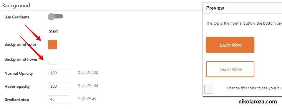
#3 Background
You saw in the image above how ugly it looks, orange borders with the blue background. I want that changed ASAP. The risk is too high, I’m getting a headache 😉
- Background color– Orange (the same as border)
- Background color on hover– White
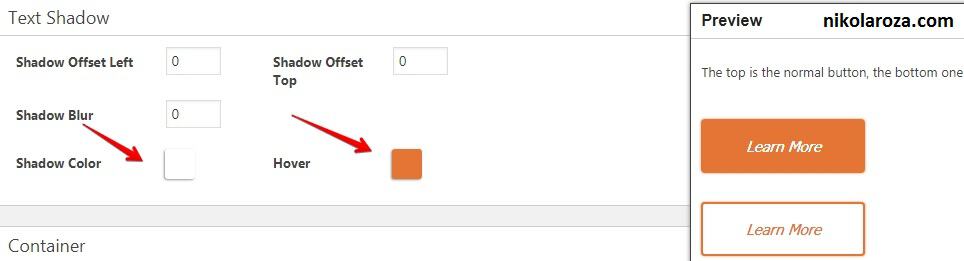
#4- Text Shadow
I want my button’s copy to stand out even more. So I’ll give it a “fuller” expression. My text in orange will get the orange shadow; text in white- white shadow.
- Text shadow– white
- Text shadow on hover– orange
And that’s how you make a button with Maxbutton plugin.
Now let’s go and make it happen in WordPress
How to add a button to a blog post/page?
Once you’ve installed the plugin and have created you first button, a new button (cute) will appear in your dashboard
Like here:
So you click it; and then you pick which button you want and than you update the page.
And here’s the result:
[maxbutton id=”11″ ]
Note. If you click it will take you to my review of the SiteRubix Free Website Builder. It’s a place that has helped me build my first site ever, which later grew to become my freelance writing business.
Check it out! 🙂
How to Make a Button in WordPress Without Using Shortcodes (Forget About Shortcodes)
In my opinion- MaxButton plugin is the best button generator for WordPress, in the world.
With it you can craft some truly magnificent buttons, even if you boast zero artistic talent.
But there’s a problem:
All buttons made through MaxButton are based on shortcodes, Meaning, if you were ever to remove the plugin, all your hard work would disappear with it. And, if you’re looking to explore more advanced and dynamic shortcode options, check out AIO Shortcodes, a powerful tool that can enhance your WordPress experience.
STOP!
Don’t despair 😉
Don’t you dare and be sad… 🙁
For there’s an answer- Forget About Shortcodes.
This is a plugin that helps you make decent-looking buttons that won’t be plugin-dependent.
Meaning, the buttons will be here to stay.
So:
- Go and install this plugin.
- Afterwards, enter the “edit mode” of any post you want and you’ll see a new option appeared in your dashboard.
- Click it!
- And you’ll enter the button editor:
Here’s what you can do:
- text– Your CTA goes here
- url– Whee will the button lead?
- nofollow; No for all links. Exceptions are un-trusted sites and affiliate links
- open in new tab- Yes, if you want them to leave. NO if you want them to stay
- icon– I like this. You can have a favicon that shows what the button is about. My button has an image of a page with one side folded. I hope it communicates that people can read/learn more if they click.
And here it is:
Nice:).
Also, this button in your WordPress dashboard behaves a lot like an image. so you can align it left or right just like you would with an image.
Bonus #1- How to Have a Floating Button in Your Widget Sidebar
Let me guess:
You dress your links in buttons because you earn money when they get clicked.
Right?
You’d prefer it if the button could sort of be attached to the widget sidebar, and that it follows the reader and never leaves his sight.
But you’re not sure how to do it.
Then this mini tutorial is for you.
First, you need to place your button in the sidebar. So go to Appearance»widget»text widget; and drag-and-drop the widget to your sidebar.
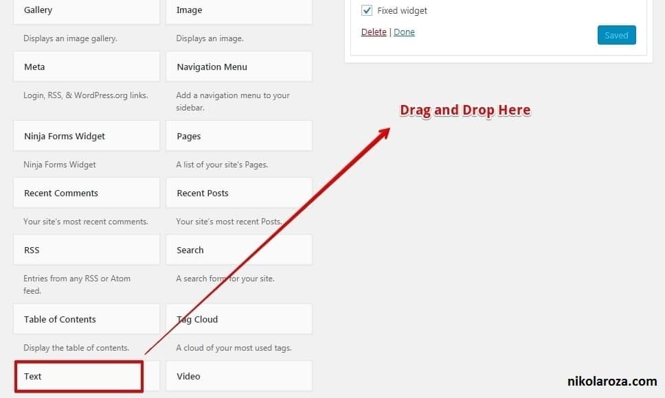
Now go and fetch you Maxbutton short code. You’re going to paste it into your text widget and that’ll create a button in your sidebar.
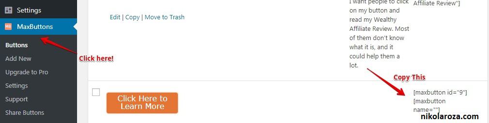
To find the shortcode you need to enter the plugin’s back-end.
So, within your WordPress dashboard:
- find the MaxButtons tab,
- click on it.
- Then copy the short code
Now just go and paste the code in text widget and click update and that’s all there is to it.
Note- If this sounds complicated to you- no worries.
Here’s a gif(t) to help you out:)
How to Make the Buttons Float in Your Sidebar (Sticky Sidebar Button)?
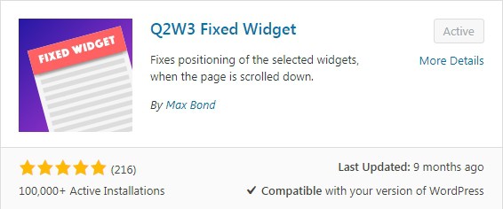
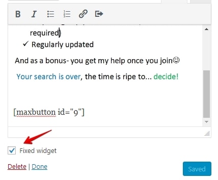
Once again- really simple. Go and install the Q2W3 Fixed Widget Plugin.
Once done- you don’t have to do anything,. Really, that’s it.
Now go Appearance» widget» text widget and simply check the new check box that appeared.
 Tips for Getting the Most out of Your Buttons- Make Them Work for You
I know you know this:
Buttons are meant to be clicked on.
Moreover, not all of them are up to the task. In fact, most of them fail miserably.
But are the buttons at fault here?
I think not!
It’s the fault of those who design them without considering: “is this the right way to go about it”.
There’s real science behind button design and placement and that’s what you’ll learn next.
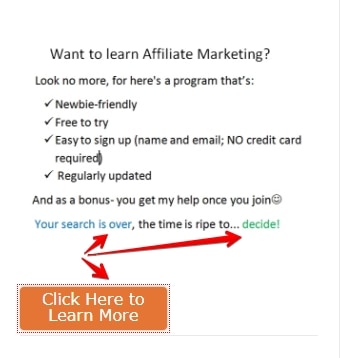
#1. Compelling Copy Rules- Write to Tell, to Show, to Push
Every button is by its very design meant to be short. You don’t ever see a button with a paragraph in it.
Or you do, but you shouldn’t. 🙂
The most important part of any button is the message it gives.
This means copy.
It should be:
- Brief. No more than 5 or 6 words
- One sentence. Two when needed- but short. e.g.,”Try it Now. It’s Free”!
- Concise. Make it clear what will happen after someone clicks
Note. Sometimes the button copy is too short to clearly explain what will happen. In that case, you can either leave it be, hoping it won’t matter;
Or you can add a short explanation right below.
Remember the button you saw a minute ago? Did you notice it had a brief explanation beneath it, telling you what will happen if you click on it?
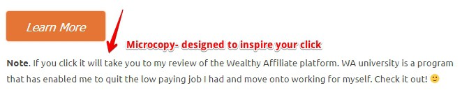
I placed that small copy strategically, to remove any click fear you might’ve had.
I suggest you do the same for your readers. That way you’ll get more of them to click. It’s a proven strategy. 🙂
#2. Placement- Where to put a button?
Your button deserves the spotlight. It’s that important to your business.
But it also NEEDS the spotlight.
Why?
Because only then can it contribute to your business.
Now:
You don’t need to over-complicate this.
Think about it.
What is a button? It’s a CTA (call to action).
And what is a CTA?
A way for action takers among your readers to, well, take action. To get what they want.
And do they know what they want? They do- because you tell them!
You tell them with your enticing article copy.
Bottom line– The button has to come after the words.
Here is a proven content creation template for you to use
- Eye-capturing headline
- Interesting copy (content tables; excellent formatting, with lots of images)
- Clickable button (CTA)
This thing works. Use it and don’t feel bad that it isn’t groundbreaking stuff. It doesn’t have to be.
Note– If you’re thinking of increasing user engagement on your site, here’s another way to do it. It’s easy; and it’s free- it’s a hack
Because you only do it once and from there it accumulates on it’s own.
#3. Button Needs to Stand Out
This is a big one.
Too often I see a page with their CTA tucked away neatly to the sidebar, footer(?), or even between the text (where it blends in a bit too well- it becomes invisible).
I am sure these are not performing well.
And if somehow they are, it just means they could do much better.
Your button needs to stand out.
But how to do it?
There are three factors you must consider:
- Color
- Size
- Shape
a) Button Color-Which One Performs the Best?
You think colors are important for button design right? Yes?
Must be crucial for conversions, right?
You’ll be surprised but, no.
Color psychology is a branch of psychology that examines color and how it influences us, humans.
And their findings can be applied to internet marketing.
And all the tests (a huge number of them) have proven without a shadow of a doubt- there is no ONE color.
They all work and they all don’t.
The point is:
Sorry to burst your bubble, but there is no one colour, one special shade of a shade of a color that, when applied to a button, gives off an irresistible “click me” vibe.
With that said, you can use logical thinking and common sense to make the best out of this uncertainty.
Think about it like this:
If you have an affiliate website that sells children’s toys, would your use black and grey for your design and buttons? No, you’d be better of with light blue, yellow and bright orange.
If you have a website that sells orange juicers- would you use lemon-yellow? I doubt you would.
For example:
My chosen colors are green because green is the name hope and prosperity go by.
Orange because it is a color that compels you to do something (using SEO) to improve your life and current situation.
And light blue to instill hope that better future (through affiliate marketing) is possible for you.
And what is the tagline of my website (SEO for the Poor and Determined)?
Do the colors match the theme?
Oh, yes they do… 🙂
My advice. Make sure that your button stands out.
That is all that really matters and not the color in and of itself.
Make it stand out to see how it performs, and then you can change the colour, or the shade of it and measure the impact the change had.
P.S.
I write this after I’ve already written and published my article. I remembered that to make your button stand out, you first need to decide on the colors to represent your brand.
This isn’t hard to do.
Just think about the overall theme and topic of your website, and find those s that’re the best match.
I can’t help you with the former but I can give you a list of basic colors and what they represent:
Black– Power, elegance, control, luxury, authority, strength…
Green– Life, nature, growth, money, freshness, balance, restfulness…
Blue– Peace, trust, confidence integrity, calmness, honesty stability(you will notice that many lawyers have their website dressed in light blue- no doubt to instil the sense of security- you’re safe in their hands).
Red– Love, passion, energy, anger, sale danger, romance…
Yellow– Intellect, warmth caution, optimism, happiness, playfulness, warmth…
Orange– Health, wealth attraction youthfulness, innovation, creativity, success…
Purple– Royalty, nobility, wisdom, transformation…
Pink– Love, romance tenderness, acceptance, compassion, beauty, friendship…
White(that’s white)- Cleanliness, coolness, simplicity, light light, goodness, hope…
These are the basic colors and just scratching the surface of it all. But it’s something to get you thinking, hopefully 😀
Suggested resource:
- https://www.quicksprout.com/the-complete-guide-to-understand-customer-psychology-chapter-4/
b) Button Size- Larger? Yes?… No?
It is difficult for me to prescribe how large a button should be.
On the one hand, you want it to be big enough so that it can’t be missed.
On the other, you want it small enough to have the balance between the copy and the button.
There’s nothing more jarring than having a GIANT button; except having a mouse one
My advice:
Measure the button against font size of the copy AND against the place you put it. If it’s right beneath the words, (like next line beneath), then it should be a bit larger (and of contrasting color).
If its a little further below, then it’s already centred and prominent enough, and doesn’t have to be humongous.
Note. The button I made for this post is a good example. You saw it clearly yet it didn’t obscure the text; nor was it so eye-popping as to make you uncomfortable.
I suggest you keep your button a good distance below the content (yet not so much for the reader to lose sight of the copy).
This is because you want to give your reader some breathing space.
They’ve just read your article; they’re exhausted; need time to think. That time is really only one second needed to look down and see your button that says “click here to learn more”.
“Ok, maybe I will”. They’ll think. 😀
Whereas if it were right beneath the words, They would look and think: “What? More stuff to read! I’ll pass”.
This is MY TAKE on perfect placement and size. You’ll have to test and see what works best for YOU.
c) What is the Best Shape for a Button?
Buttons nowadays are mostly rectangular and that is what the reader expects a button to be.
But there’s a problem: should they have sharp or rounded edges?
I say make them rounded and here’s why:
1. Buttons with rounded corners are easier on the eye.
What I mean is:
A part of the eye called fovea processes both rounded and sharp forms. But much faster the former.
In marketing, this translates to more people “getting” the button’s message much faster.
Trust me, even milliseconds are crucial when people are weighing whether to click or not.
2. Don’t go against the subconscious (it’s too strong a foe).
We humans are in many ways still quite primordial.
One remnant of this is our fear of sharp objects. Sharp objects like arrow heads, rocks, glass shards, or… rectangle-shaped buttons with pointy edges.
It sounds silly but this fear is deeply rooted in our subconscious, and it can work against you big time.
3. Sharp edges point outward saying: “look away, nothing to see here”.
This is not the effect you want to achieve. Rounded edges point inward and say: “Hey, look here!
What does the button copy say”?
What About Ghost Buttons?
First, what are ghost buttons?
Here’s one:
[maxbutton id=”12″ ]
Ghost buttons are transparent buttons that appear as an outlined text.
They’re a relatively new thing. First appeared in 2014. peaked a year later and now slowly disappearing.
I say slowly because they are here to stay for a very long time (they caught on with some very popular/big sites).
For example, here’s how DropBox uses them. They have three buttons;
What do you think:
which one is there to contrast with more desirable alternatives?
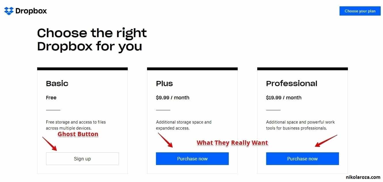
Here’s their reasoning with this design.
They’re a business and obviously want to make money. That’s why they have two buttons that when clicked will result in a purchase. It’s convenient for those who’ve already decided.
But they also have one ghost button for those (most folks) who are not ready to buy.
Their goal is to on-board them first, and get them to upgrade later.
So this landing page gives DropBox immediate results and long term value.
Nicely done:)
Ghost buttons offer one big advantage over their full-bodied sibling- they look pretty.
When done right a ghost button can be both elegant and effective. A button of dreams.
But should YOU use it?
I advise against it.
This is because it is very hard to nail it just right (if you don’t, the button will be invisible and won’t work);
and because the results of some tests show that when and where ghost buttons are effective, regular buttons in their place would convert even better.
If you do decide to try them out, the rules are the same as for regular buttons:
- Placement– must be very prominent
- Color– even more important as the only colored thing will be the border
- Size– larger is better- Size works in conjunction with placement and the color you chose
My advice– Master the regular button first. Later on, it will be easy to expand to the ghost realm:-
My Experience With Ghost Buttons
I admit I played with the idea of having a ghost button in my top right sidebar.
I wanted to do it because I thought (and still do) they’re stylish and blend well with the theme of my site.
But that wasn’t the only reason.
I studied colour psychology a bit and know that bright orange is a colour that demands attention and action from people.
My bright (pun intended) idea was this:
Have the ghost button in a strategic place above the fold, and when people hover over it wondering whether to click the button would surprise by turning bright orange.
This sudden fullness of color, combined with the intense orange that says “do it”, would make the button irresistible.
That was my theory at least, but I never went through with it.
Wanna know why?
I decided that psychological trickery is not something I should be doing.
No, I had to focus on my content, develop a viable keyword strategy (with Jaaxy’s help), and generally, make my website as useful as it can be to the people. Then conversions will naturally come because of it.
And then I could improve them.
Bonus- How to draw attention to your button
Creating a button is nice and all, but it’s of no use if no one clicks on them.
Now, don’t get me wrong- make a decent button and people are going to click on it. Period.
But I’m thinking of ways to boost that precious CTR.
Want to know what they are?
(there’re two ways to do it)
a) Draw an arrow and point it at the button
A few years ConversionXL did an original study.
They wanted to determine which visual cue attracts attention the most.
They tested six variants of a landing page and found that the one with hand-drawn arrow performed the best.
Their advice- it’s worth testing (read about it here)
![]()
Click the link if you want to learn more, but now I’ll show you how to draw a simple arrow in Paint and then insert it into your WordPress editor.
The Steps:
- Open up Paint– I assume you have it installed, (comes with your Windows operating system)
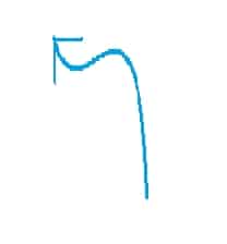
- Draw an arrow– must not be horrendous as my example below.
![]()
- Take a screenshot of your arrow (and save it)
- Insert it next to your button, aligned so that it points to your button
[maxbutton id=”11″ ]
There, does it not look better like this? Thanks to this arrow, this button is going to get clicked a whole lot more.
Who knows, maybe you will too?
P.S.
This method works but it’s tedious . I would rater use a plugin to draw arrows. If you know of one, recommend it in the comments below, thanks:)
b) Finger pointing- Show me where to click!
Arrows are used to point at things, ant they’re the best for the job. But let’s not give them exclusive bragging rights (lest they become too haughty and shun us).
You can also use fingers to point at stuff and it works really well too.
Here’s how a master marketeer Pat Flynn does it. He looks at you but his index finger points at the message he’d like you to see.
“he’s a crash dummy of marketing; testing things so you don’t have to…”

I’m sure this is very effective at driving clicks.
Well done Pat:)
Correction:
I wrote this because I though I knew what I was saying.
I was wrong.
The image is not clickable.
That means it’s purpose is long-term brand building.
c) Eye gaze- look where I look
The same study that determined the arrow’s effectiveness at getting you to look, also found that people like to gaze at other people, especially at where they look.
So, if you have an image of a person and that man/woman has their gaze thoroughly fixated at the button… guess where your visitor will look?

Bonus- Blue Host Landing Page Analysis
This long guide on crafting WordPress buttons is coming to an end. And I’ve saved the best for last.
I want to quickly breakdown the lading page of Bluehost, maybe the biggest hosting providers in the world.
Their page is a master piece of conversion optimization (which makes their affiliates super happy), and perfect for showcasing you what well-designed buttons can do, and how they work in conjunction with other elements on the page.
Ready?
First, take a look:
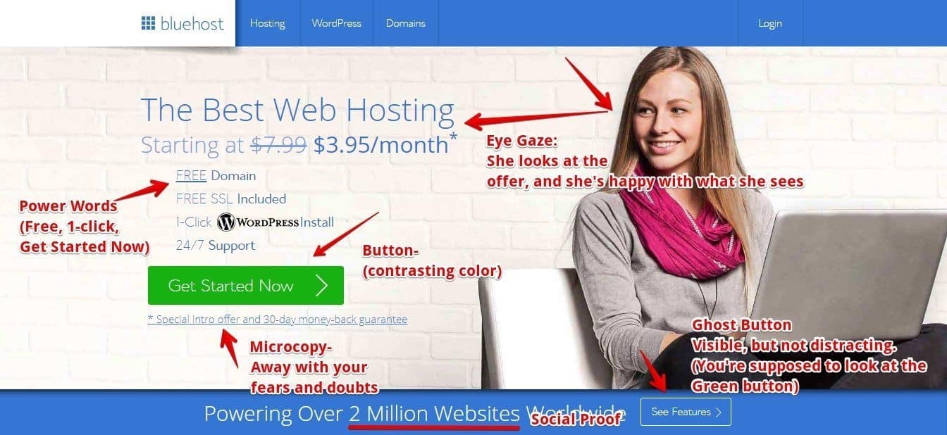
First, you can see there are two buttons. One (green) pushes you with to click it by:
- Being a vibrant, enthusiastic green
- Being big and noticeable
- By having micro-copy around it
- And by being surrounded with power words
The other button is a ghost button. It’s purpose is to convince the unconvinced to at least see the features. And afterwards, who knows…
Also, the girl on the page is looking at the green button and is clearly pleased with what she sees.
There’s no arrow but the page doesn’t need it.
It’s perfect.
Conclusion- I Know You Know know how to create a button In WordPress?
I’ll start my conclusion the same way I started my introduction.
Buttons huh?
They’re small, but pack one heck of a punch.
Use them well and you’re golden; use them without thinking and you WILL fail.
The difference between the introduction and conclusion?
Now you know:
- How to make your own buttons in WordPress,
- How to add buttons to a WordPress blog post/page,
- AND how to make them grab attention of everybody, especially those people that are ready to buy and are just looking for the right button to click on. 😀
Listen:
I want to hear from you.
Do you like the button I made? Do you think this method is easy?
Do you use another plugin or know of another method for creating buttons in WordPress?
Please, do tell me. I am a WordPress junkie and my fix is knowledge, more and more knowledge.
Thank you for reading and don’t forget to share with your friends,
It helps a lot…
Nikola Roza
Nikola Roza is a blogger behind Nikola Roza- SEO for the Poor and Determined. He writes for bloggers who don't have huge marketing budget but still want to succeed. Nikola is passionate about precious metals IRAs and how to invest in gold and silver for a safer financial future. Learn about Nikola here.
Hi nikola..
Very interesting button, can this button be used on blogger? I want to display it on my blog so it looks more impressive. Thank you
Hi Hendry,
You cannot use MaxButton plugin in Blogger. It’s because Blogger doesn’t support plugins and you can’t install any. If you want to have buttons in Blogger, or in any other free website, you’re going to have to learn to code them yourself.
Hi Nikola,
Yes, Button allows the audience to bring more attention to your post.
WordPress actually does not offer to add buttons in your posts or pages by default, you have to add plugins.
A must read for those who want to get more conversions from their contents.
Thanks,
Jeangam Kahmei
Thanks, Jeangam,
yeah, you need a plugin to get a button in WordPress, especially a good looking one. Ugly buttons collect internet dust.
Hi Nikola,
Buttons have become the most common and essential part of any blog. But, Yeah one needs to do everything right, whether it could be proper placement of it and lot depend on its style too.
A proper Call to Actions will bring up good sales. We need to keep on trying what is working for our blog. I use Hotjar heatmap for the same purpose whenever required. And I see a lot of changes (clicks )when I changed the button style on my blog.
Personally, I like Ghost Style buttons too, but every blog has to offer something else. and what could work for one, might not for another blog.
I generally do all the manual coding to change the button style, but the plugin you have offered seems to save a lot of time with some great customization options too.
Thanks Buddy
Hi Navin
thanks for sharing your experience with us. You’re right, buttons are great, but even a well performing button can be made to draw in clicks even better, and that’s what heatmaps are for.
Thanks for your valuable comment, Navin:)
Nikola this is cool bro. A little short code makes a huge difference. A wee bit gussies up your blog quite nicely. I dig it. Fabulous post.
Thanks Ryan,
Creating pretty buttons is that small tiny thing you can do today that’ll yield a tonne of returns over time. It can’t be beat for the effort you put in making a decent button.
Hi Nikola,
Your article is well rounded. I love the tutorials since it helps me with knowing a few tricks in button creation. The Pt Flynn image is strikingly fantastic an I have tried to mimic him but comes short of it. I’m not done yet, as I will since give a try sometime again.
Thank you so much for the share.
Hi Moss,
glad you enjoyed the article. Yeah, Pat is a legend and we can all learn a thing or two or three from him.
Hi Nikola,
I’m still trying to get something similar to MaxButtons so that I can create a static front page on my blog.
Hi Nikola,
What a joy to be here today, I am here via Enstine Muki’s page.
This is really a great tuto for me, I read about the importance of these buttons on our contents.
I am bookmarking it for my further implementation.
Thank you so much for writing and sharing such informative posts to your readers.
will visit again to read more such posts in the future.
Keep sharing
With kind regards
~ Philip Ariel
@pvariel
Hey Philip,
thanks for you kind words. Yeah, buttons help links getting noticed,and once they get clicked- anything can happen:)
Thanks for commenting, Philip.